The Heinz logo is a prime example of subtle branding that carries deeper meaning, which is seamlessly woven into its design. At first glance, the Heinz logo appears straightforward, primarily consisting of the brand name in a distinctive typeface within a keystone shape. However, this design choice is loaded with historical and symbolic significance that strengthens the brand’s identity.
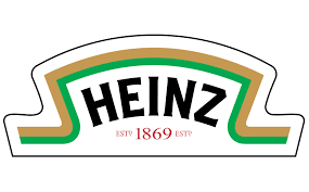
- Keystone Shape: The most prominent hidden message in the Heinz logo is the keystone shape itself. This shape is a direct reference to the company’s origins in Pennsylvania, which is known as the “Keystone State.” The keystone is an architectural element that symbolizes strength and stability, which Heinz associates with its brand. By incorporating the keystone shape, Heinz subtly communicates its long-standing reliability and foundational role in the food industry.
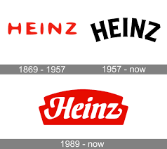
- Historical Significance: Heinz has a rich history dating back to 1869, and the keystone shape also pays homage to this heritage. The keystone shape has been part of the Heinz logo since its early days, creating a sense of continuity and tradition. This helps reinforce the perception of Heinz as a trustworthy and enduring brand that has been a staple in households for generations.
- Typography and Color: The typography of the Heinz logo is designed to be bold and legible, ensuring that the brand name stands out. The use of red in the logo is also significant. Red is often associated with appetite and food, making it an effective color for a food brand. It grabs attention and evokes a sense of urgency and hunger, making the products more appealing to consumers.
- Simplicity and Clarity: The simplicity of the Heinz logo is another key aspect of its design. By keeping the logo clean and straightforward, Heinz ensures that it is easily recognizable and memorable. This simplicity also conveys a sense of purity and quality, aligning with Heinz’s commitment to using high-quality ingredients in its products.
- Emotional Connection: The hidden messages within the Heinz logo go beyond just visual design; they also create an emotional connection with consumers. By embedding references to its heritage and reliability, Heinz taps into the nostalgia and trust that consumers have developed over the years. This emotional bond strengthens brand loyalty and reinforces the perception of Heinz as a brand that people can rely on.
In summary, the Heinz logo is a masterful blend of simplicity, historical reference, and emotional appeal. The keystone shape serves as a nod to the company’s origins and symbolizes strength and reliability. The use of bold typography and red color enhances visibility and appeal, while the overall simplicity ensures that the logo remains timeless and memorable. Through these design elements, Heinz effectively communicates its brand values and establishes a strong connection with consumers.