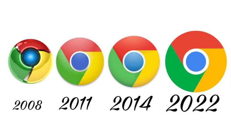
The logo of Google’s famous internet browser Chrome is being updated. After eight years, the minor alteration is finally here, according to Google Chrome designer Elvin Hu, and will offer the product a “modern experience.”
Hu explained the modifications in a lengthy Twitter thread, stating that they were done in response to the many operating systems that Chrome is available on. “To match the look of the rest of the system icons on ChromeOS, they use brighter colors without gradients.” They seem 3D on macOS. “We used colorful ribbons on Beta and Dev,” he explained.
The new logo first appeared on February 4 and is now accessible on Chrome Canary (the developer version of the browser). Over the following several months, it will be pushed out to the rest of the world.
“To align with Google’s more modern brand expression, we simplified the main brand icon by removing the shadows, refining the proportions, and brightening the colors,” stated Elvin Hu.
“Fun fact: we also discovered that putting certain shades of green and red next to each other created an unpleasant color vibration, so we introduced a very subtle gradient to the main icon to mitigate that, making the icon more accessible,” he said in a later tweet.
The blue circle in the centre appears to be larger as a result of these adjustments. The logo’s colors have also been brightened.
The designer went on to explain why the difference is so little.
“Why bother with something so subtle?” you might wonder. With features like Native Window Occlusion on Windows, day-one M1 support on macOS, Widgets on iOS/Android, and Material You on Android, we personalize Chrome’s experience to each OS. “We want our brand to exude the same level of concern,” Hu explained.
He then requested input, which will assist the team in improving the product.
From 2008 until the present, the Chrome logo has become more minimalistic. What began as a gleaming three-dimensional sign has been reduced to a two-dimensional symbol.


