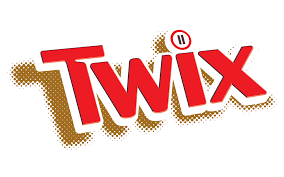
The Twix logo, while appearing straightforward at first glance, carries subtle nuances that align with the brand’s identity and marketing strategy. The logo primarily consists of the word “Twix” in a bold, dynamic font, often accompanied by the iconic gold and red color scheme. However, there are deeper elements and interpretations that enhance its connection to the product and its appeal.
Firstly, the logo’s color scheme—predominantly gold and red—plays a crucial role in its messaging. Gold signifies quality and indulgence, reflecting the rich, luxurious caramel and chocolate that make up a Twix bar. The red color adds a sense of excitement and urgency, making the product stand out on store shelves and invoking a sense of pleasure and enjoyment. This combination of colors is designed to attract attention and stimulate appetite, aligning with the brand’s promise of a delightful snacking experience.
Another subtle yet significant aspect of the Twix logo is its typographic style. The bold, slanted font conveys a sense of movement and dynamism, suggesting that Twix is an exciting, energetic brand. This aligns with Twix’s marketing campaigns that often emphasize fun, playful scenarios involving their signature “Left Twix” and “Right Twix” bars. The slant in the font can be seen as a nod to this playful rivalry, implying action and choice, which are central themes in Twix advertising.
Moreover, the design of the Twix logo also incorporates an element of symmetry and duality. This is symbolic of the twin nature of the product—each package contains two bars. The mirrored design can be interpreted as a reflection of this duality, subtly reminding consumers that with Twix, you always get two delicious bars in one pack. This design choice reinforces the product’s unique selling proposition and makes the logo visually balanced and aesthetically pleasing.
Additionally, the simplicity of the Twix logo ensures versatility and recognizability. It can be easily adapted across various mediums, from packaging to digital advertisements, without losing its impact. The clean and straightforward design ensures that the logo remains instantly recognizable, which is crucial for brand recall and loyalty. This simplicity, combined with the underlying messages of quality, fun, and duality, makes the Twix logo a powerful tool in the brand’s marketing arsenal.
In summary, the Twix logo is a carefully crafted symbol that goes beyond mere brand identification. Through its color scheme, typography, and design elements, it conveys messages of quality, excitement, and the unique duality of the product. These hidden messages not only enhance the visual appeal of the logo but also reinforce the core values and selling points of the Twix brand. The result is a logo that is not only eye-catching but also deeply connected to the product and its market positioning, making it a key element in Twix’s enduring popularity and success.
