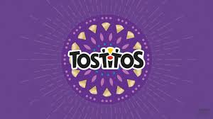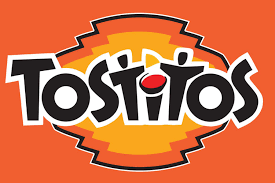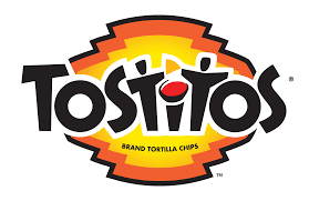
The Tostitos logo is a brilliant example of incorporating hidden messages to enhance brand identity and engagement. At first glance, the logo appears to be a playful and colorful representation of the brand name. However, a closer look reveals a clever visual trick embedded within the design that aligns perfectly with the product’s theme and usage.
The most notable hidden message in the Tostitos logo lies within the two lowercase “t”s in the middle of the word. These “t”s are stylized to represent two people, with a shared chip between them. The dot of the letter “i” in “Tostitos” serves as a bowl of salsa, completing the scene. This hidden image effectively conveys the idea of sharing and social interaction, which are central themes to the Tostitos brand. The logo suggests that Tostitos chips are best enjoyed with friends and family, making them a staple at parties and gatherings.
This design choice is particularly powerful because it subtly communicates the brand’s message without needing any additional words or explanations. The visual of two people sharing a chip over a bowl of salsa instantly evokes the social aspect of eating Tostitos, making it memorable and emotionally resonant. It reinforces the notion that Tostitos are more than just snacks; they are a means to bring people together and create enjoyable experiences.
Furthermore, the vibrant colors used in the logo—primarily red, yellow, and black—enhance this message by evoking feelings of excitement and festivity. These colors are often associated with parties and celebrations, further embedding the idea that Tostitos are an essential part of fun, social occasions. The cheerful and inviting color scheme helps to attract attention and make the logo stand out, ensuring that it leaves a lasting impression on consumers.
In essence, the Tostitos logo is a masterclass in effective branding through hidden messaging. By embedding the image of people sharing a chip and salsa within the logo, Tostitos successfully communicates its core values of sharing and enjoyment in a subtle yet impactful way. This clever design not only makes the logo more engaging but also strengthens the brand’s association with social gatherings and positive experiences. Through this thoughtful and playful approach, the Tostitos logo becomes more than just a name; it becomes a symbol of togetherness and celebration.