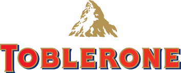
The Toblerone logo, synonymous with the Swiss chocolate bar, has a storied history reflecting both the brand’s heritage and its distinctive product. Toblerone was created in 1908 by Theodor Tobler and Emil Baumann in Bern, Switzerland. The original logo was simple, primarily featuring the brand name “Toblerone” in a straightforward, bold typeface. The name itself is a portmanteau of the founder’s name, Tobler, and “Torrone,” the Italian word for nougat, highlighting the unique combination of chocolate, nougat, and almonds that defined the product.
As the brand grew in popularity, the Toblerone logo underwent its first significant transformation in the 1960s. The redesigned logo incorporated a stylized image of the Matterhorn, the iconic Swiss mountain, into its packaging. This inclusion served to emphasize the brand’s Swiss origins and the high quality associated with Swiss chocolate. The Matterhorn also subtly echoed the triangular shape of the Toblerone bars, creating a visual and thematic link between the product and its packaging.
In the 1970s, the Toblerone logo was further refined to enhance its visual impact. The logo became more streamlined, with a sharper, more defined depiction of the Matterhorn. The typeface of the brand name was updated to a more modern, sans-serif font that conveyed a sense of contemporary sophistication while retaining its bold presence. This period also saw the introduction of the bear symbol hidden within the Matterhorn illustration, a nod to the city of Bern, whose name means “bear” in German.
The early 2000s brought another evolution of the Toblerone logo, aiming to balance tradition and modernity. The logo maintained the Matterhorn and bear elements but introduced a sleeker, more polished look. The font was updated again to a slightly more stylized, yet still bold typeface, and the overall design was made cleaner and more refined. This update was part of a broader effort to refresh the brand’s image while staying true to its Swiss heritage and the iconic features that made it instantly recognizable.
Most recently, in 2022, Toblerone introduced a new iteration of its logo. This redesign focused on further modernizing the brand while emphasizing its artisanal roots. The Matterhorn was given a more minimalist and abstract treatment, aligning with contemporary design trends. The bear within the mountain was retained but subtly integrated into the new design, ensuring it remained a distinctive and playful element. The typography was refined to be even more elegant and sophisticated, reflecting Toblerone’s commitment to quality and its premium positioning in the chocolate market. This latest logo evolution ensures that Toblerone remains a timeless yet contemporary symbol of Swiss chocolate excellence.
