Subway, the popular fast-food chain known for its customizable sandwiches, has had several logo changes since its inception, each reflecting shifts in brand identity and market positioning. The first Subway logo was introduced in 1965 when the brand was initially named “Pete’s Super Submarines.” This logo was quite basic, featuring the brand name in a straightforward, serif font. The logo was functional and reflected the straightforward nature of the brand during its early days.
In 1968, the company rebranded to “Subway,” and with this change came a new logo. The updated design featured the word “Subway” in a bold, sans-serif font, with arrows integrated into the ‘S’ and ‘Y’. The arrows symbolized the speed and efficiency of the Subway service and the choice and movement inherent in the brand’s offering. This design was straightforward but effective, encapsulating the brand’s core values of fast, customizable service.
The 1980s saw another evolution of the Subway logo, which became more colorful and dynamic. The new logo introduced a bright yellow and green color scheme, which has become synonymous with the brand. These colors were chosen to reflect freshness and health, aligning with Subway’s growing reputation for offering healthier fast food alternatives. The design retained the iconic arrows on the ‘S’ and ‘Y’, reinforcing the brand’s identity and emphasizing the idea of choice and direction.
In 2002, Subway modernized its logo to reflect its global expansion and evolving market presence. The updated logo featured a sleeker, more contemporary font, with a slight italic slant to convey motion and progress. The green and yellow color scheme was maintained but brightened to be more vibrant and appealing. This version of the logo aimed to project a fresh and modern image, aligning with Subway’s commitment to innovation and customer satisfaction.
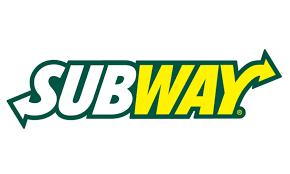
The most recent significant update to the Subway logo came in 2016, with a design that aimed to simplify and streamline the brand’s visual identity. The new logo retained the green and yellow colors but used a cleaner, more modern typeface without the italic slant. The arrows on the ‘S’ and ‘Y’ were kept but were made more subtle, integrating more seamlessly with the overall design. This minimalist approach reflected broader trends in logo design towards simplicity and clarity, and it positioned Subway as a contemporary, forward-thinking brand while maintaining its core elements of speed, choice, and freshness.