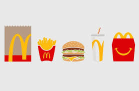
The McDonald’s logo, the iconic golden arches, has long been a symbol recognized globally. Yet, beyond its immediate recognition, it carries subtle nuances that reflect the company’s history and ethos.
At first glance, the golden arches may seem like a simple, stylized letter “M,” representing the initial of the company’s name. However, delve deeper, and you’ll discover layers of meaning intertwined with its design. The rounded, embracing curves of the arches evoke a sense of warmth and hospitality, inviting customers to step into the welcoming atmosphere of McDonald’s restaurants.
Moreover, the arches are strategically positioned to resemble the shape of a smile, subtly hinting at the joy and satisfaction that McDonald’s aims to provide its customers. This hidden message reinforces the brand’s focus on delivering happiness through its products and service, making every visit a delightful experience.
Additionally, the symmetry of the arches signifies balance and harmony, reflecting McDonald’s commitment to consistency and quality across its global network of restaurants. It conveys a message of reliability, assuring customers that they can expect the same level of excellence whether they’re in New York City or Tokyo.
Furthermore, some interpretations suggest that the arches also symbolize the company’s upward trajectory and ambition for growth. Rising triumphantly into the sky, they represent McDonald’s journey from humble beginnings to becoming a dominant force in the fast-food industry, constantly reaching for new heights of success.
In essence, while the McDonald’s logo may appear simple at first glance, it harbors a rich tapestry of meanings that speak to the brand’s values, aspirations, and commitment to customer satisfaction. It serves as a visual representation of McDonald’s identity, encapsulating its history, ethos, and vision for the future in a single, iconic emblem.