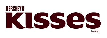
The Hershey’s Kisses logo is a clever example of how hidden messages can be embedded in a seemingly simple design to convey deeper meanings and reinforce brand identity. At first glance, the logo appears to be a straightforward depiction of the words “Hershey’s Kisses” in a classic, elegant font. However, there is a subtle and clever hidden message within the logo that enhances its impact.
The hidden message in the Hershey’s Kisses logo is found between the letters “K” and “I” in the word “Kisses.” If you look closely, you will see that the space between these two letters forms the shape of an extra Hershey’s Kiss. This clever design element not only adds a playful touch to the logo but also reinforces the brand’s focus on its iconic chocolate product. By incorporating the image of a Hershey’s Kiss into the negative space of the logo, Hershey’s subtly reminds consumers of the product even when they are looking at the brand name.
This use of negative space is a brilliant design strategy because it engages the viewer and invites them to discover the hidden kiss, creating a moment of delight and surprise. This discovery can enhance the consumer’s connection to the brand, making the logo more memorable and enjoyable. It also demonstrates the attention to detail and creativity that Hershey’s applies to its branding, reflecting the same care and quality that go into making their chocolates.
Additionally, the hidden Hershey’s Kiss in the logo emphasizes the brand’s heritage and longstanding tradition. Hershey’s Kisses have been a beloved chocolate treat for over a century, and this subtle inclusion in the logo pays homage to the product’s iconic status. It serves as a reminder of the brand’s history and its commitment to maintaining the classic appeal of Hershey’s Kisses while also incorporating modern and clever design elements.
Overall, the Hershey’s Kisses logo is a masterful blend of simplicity and hidden messaging. The incorporation of a Hershey’s Kiss in the negative space between the letters not only adds a playful and engaging element to the design but also reinforces the brand’s identity and product focus. This clever use of negative space captures the essence of Hershey’s Kisses, making the logo more than just a visual representation of the brand name—it becomes a subtle yet powerful symbol of the product itself. Through this thoughtful and creative design, the Hershey’s Kisses logo stands out as a memorable and effective piece of branding.