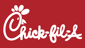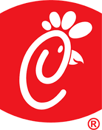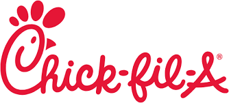
The Chick-fil-A logo is a well-crafted design that incorporates a hidden message that aligns with the brand’s identity and values. At first glance, the logo seems to be a straightforward representation of the brand name with a playful and distinctive typeface. However, a closer inspection reveals a clever visual element embedded within the text.
- Chicken Head in the “C”: The most prominent hidden message in the Chick-fil-A logo is found in the first letter “C”. This letter is designed to resemble the head of a chicken, complete with a beak and comb. This subtle design choice immediately communicates the primary product of the restaurant—chicken sandwiches—without the need for additional imagery or explanation. It’s a smart way to visually link the brand to its signature offering, reinforcing the connection between the name and the product【20†source】.
- Playful and Inviting Design: The typography of the Chick-fil-A logo is whimsical and playful, which helps to create a friendly and welcoming brand image. This is intentional, as Chick-fil-A aims to provide a family-friendly dining experience. The playful design appeals to a broad audience, including children, which aligns with the brand’s positioning as a place where families can enjoy a meal together【20†source】.
- Color Scheme and Emotional Impact: The use of red in the Chick-fil-A logo is a strategic choice. Red is a color that is often associated with appetite and excitement, making it an effective choice for a restaurant logo. The vibrant red catches the eye and stimulates hunger, encouraging people to visit the restaurant. Additionally, red is a color that evokes passion and love, subtly suggesting that Chick-fil-A is passionate about its food and service【20†source】.
- Simplicity and Versatility: The simplicity of the Chick-fil-A logo ensures that it is easily recognizable and versatile across different mediums. Whether on signage, packaging, or digital platforms, the logo maintains its clarity and impact. This simplicity also reflects the brand’s straightforward approach to its menu—focusing on high-quality chicken sandwiches and providing consistent, friendly service【20†source】.
- Emphasis on Quality and Tradition: The elegant script font of the Chick-fil-A logo conveys a sense of tradition and quality. It suggests that the brand takes pride in its heritage and commitment to high standards. This aligns with Chick-fil-A’s reputation for quality food and excellent customer service. By incorporating these subtle messages into the logo, Chick-fil-A reinforces its brand values and ensures that these qualities are immediately communicated to its audience【20†source】.
In summary, the Chick-fil-A logo is a masterful design that incorporates hidden messages to reinforce the brand’s core values and offerings. The chicken head in the “C” cleverly links the logo to the brand’s primary product, while the playful font and vibrant color scheme make the logo inviting and memorable. The simplicity and elegance of the design ensure versatility and communicate a commitment to quality and tradition. These elements combine to create a logo that is not only visually appealing but also deeply connected to the brand’s identity and mission.