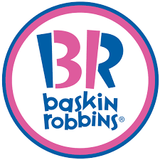
Baskin-Robbins, the iconic ice cream brand, has a rich history that is reflected in its evolving logo design. The company was founded in 1945 by Burt Baskin and Irv Robbins in Glendale, California. The original logo was simple, featuring the names of the founders in a traditional serif font. The design conveyed the company’s straightforward, no-nonsense approach to ice cream, focusing on quality and flavor variety. As the brand grew in popularity, the need for a more distinctive and recognizable logo became evident.
In the 1950s, Baskin-Robbins introduced a new logo that prominently featured the number “31.” This number was significant as it represented the company’s unique selling point of offering 31 different flavors of ice cream, one for each day of the month. The logo included a pink and brown color scheme, symbolizing two of their popular flavors: cherry and chocolate. This logo helped establish Baskin-Robbins’ identity and differentiate it from competitors by highlighting its extensive flavor range.
By the 1980s, Baskin-Robbins updated its logo to reflect a more modern and playful image. The new design incorporated a more vibrant pink and blue color palette, making the logo more eye-catching and appealing to families and children. The typography was also updated to a more contemporary style, with a playful, rounded font that evoked a sense of fun and enjoyment. This era also saw the introduction of the iconic “31” embedded within the “BR” initials, cleverly designed to be both a part of the logo and a reminder of the brand’s core offering.
In 2006, Baskin-Robbins unveiled a significant logo redesign that further emphasized the “31” concept. The logo featured the “BR” initials with the “31” cleverly hidden within the letters, using the pink and blue color scheme. This design was both a nod to the company’s heritage and a modern twist that reinforced its commitment to variety and quality. The use of bright, bold colors and clean lines helped the logo stand out in a crowded marketplace and appeal to a new generation of ice cream lovers.
The most recent update to the Baskin-Robbins logo came in 2022. The new design maintained the hidden “31” within the “BR” initials but introduced a more streamlined and contemporary look. The color palette was updated to a deeper shade of pink and a more subdued blue, giving the logo a modern and sophisticated feel. The typography was also refined to be sleeker and more elegant, reflecting the brand’s evolution while still celebrating its rich history. This latest logo iteration continues to honor Baskin-Robbins’ legacy of innovation and variety in the ice cream industry, ensuring the brand remains relevant and beloved by customers of all ages.
