- Betty Crocker
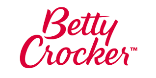
The “Betty Crocker” logo, a familiar emblem on baking products, carries more than just a brand name. Upon closer examination, it reveals a hidden message that subtly underscores the brand’s heritage and trust. The red spoon, prominently featured in the logo, is not merely a utensil; it symbolizes the traditional values of home-cooked meals and family gatherings. This choice of imagery invokes a sense of nostalgia and reliability, suggesting that products bearing the “Betty Crocker” name are synonymous with quality and warmth. The flowing script of the logo further enhances this message, evoking the handwritten recipes passed down through generations, reinforcing the idea that Betty Crocker is not just a brand, but a trusted kitchen companion rooted in the comforting traditions of home cooking.


2) Tostitos
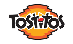
The “Tostitos” logo features a clever hidden message that enhances its branding and reinforces the product’s purpose. Within the word “Tostitos,” the two “T”s in the middle are designed to resemble two people sharing a chip, with a bowl of salsa represented by the dot of the “I” between them. This imagery subtly emphasizes the social aspect of snacking on Tostitos chips, highlighting the idea of sharing and enjoying together. The hidden figures and the salsa bowl creatively encapsulate the spirit of fun and communal snacking, making the logo not just a brand identifier, but also a visual storytelling tool that connects emotionally with consumers.

3)Twix
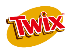
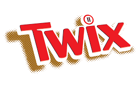
The “Twix” logo subtly incorporates a hidden message through its design elements, emphasizing the concept of duality and choice, which are central themes of the brand. The two “i”s in the word “Twix” are often highlighted or styled to represent the iconic twin sticks of the candy bar. This design choice reinforces the idea of “two for me, none for you” or “two in one,” playing on the fact that each package contains two bars. Additionally, the use of gold and red colors in the logo conveys a sense of luxury and indulgence, aligning with the brand’s image of providing a rich, satisfying treat. The clever integration of these visual cues invites consumers to recognize and appreciate the dual pleasures that Twix offers.


4) Arm & Hammer
The “Arm & Hammer” logo features a muscular arm holding a hammer, a design that has been around since the 1860s. While it appears straightforward, the logo carries a subtle hidden message. The image of the strong arm wielding a hammer symbolizes industry, strength, and hard work, qualities the brand aims to be associated with. The logo is meant to evoke trust and reliability, suggesting that products bearing the “Arm & Hammer” name are effective and dependable. This symbolism ties back to the company’s origins and its emphasis on the purity and utility of its baking soda product, which has versatile household uses from baking to cleaning. By integrating these elements, the logo subtly communicates the brand’s commitment to quality and the enduring strength of its products.


5) Baskin-Robbins
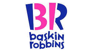
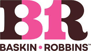
The “Baskin-Robbins” logo cleverly incorporates a hidden message within its design. The logo features the brand name with the initials “B” and “R” prominently displayed. The “B” and the “R” are styled in a way that highlights the number “31” within the letters, symbolizing the original idea of offering 31 different flavors, one for each day of the month. This playful integration of the number “31” reflects the brand’s commitment to variety and its heritage of providing a diverse range of ice cream flavors. The pink and blue colors used in the logo add to its fun and inviting appearance, appealing to both children and adults alike.

6) Nestlé
The “Nestlé” logo, featuring a mother bird feeding her three nestlings in a nest, carries a subtle message of nurturing and care. This imagery aligns with the company’s mission of providing nutrition, health, and wellness products. The bird feeding its young symbolizes the nurturing role Nestlé aims to play in the lives of its consumers, emphasizing the importance of nourishment from a trusted, caring source. This hidden message reinforces the brand’s identity as a provider of essential and wholesome products for families worldwide.